Oura Ring Heart Rate Analysis Using R
This page presents an analysis of my Oura Ring heart rate data collected between July 30, 2024 and September 30, 2024, analyzed using R.
Summary Statistics
Over the 63-day period analyzed:
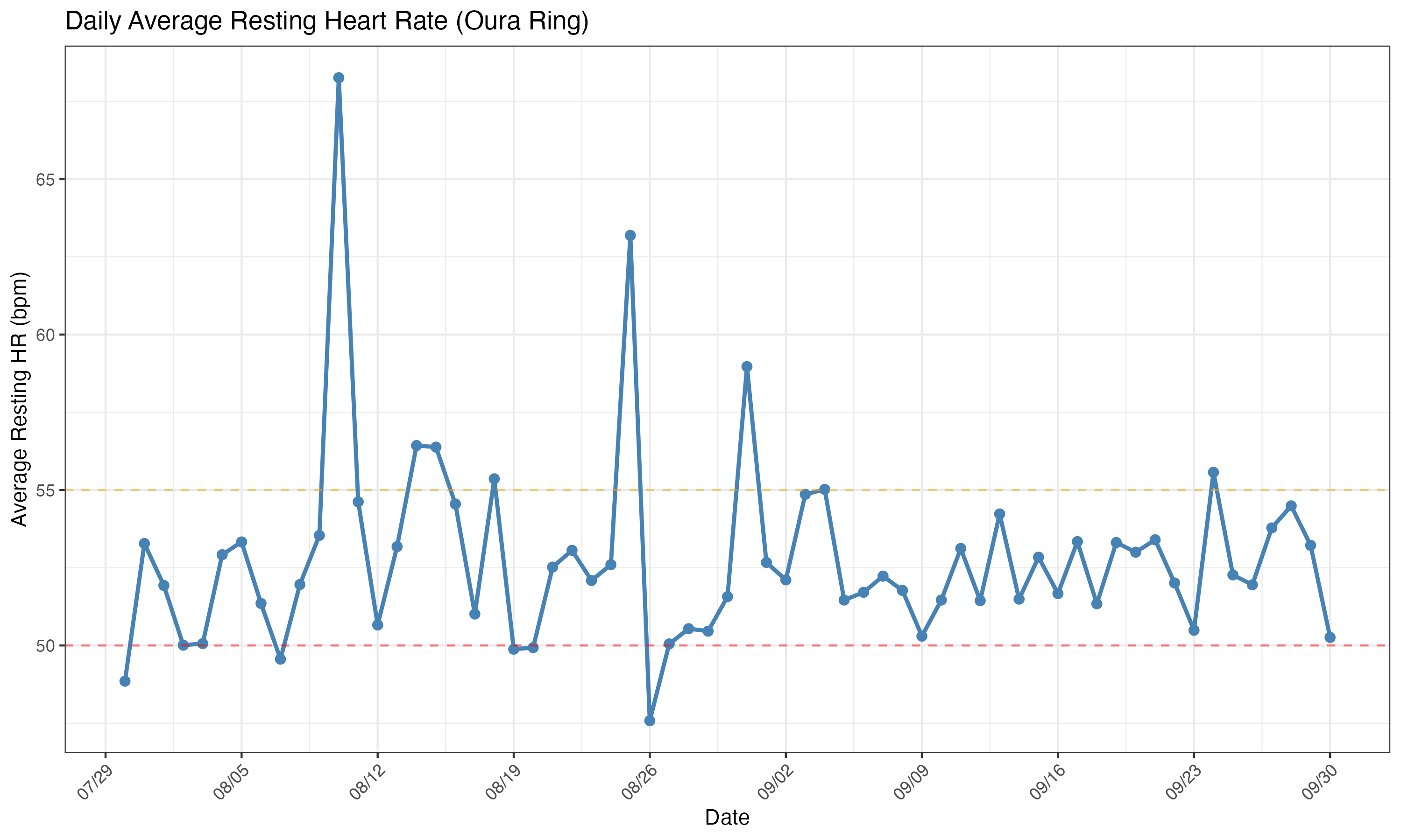
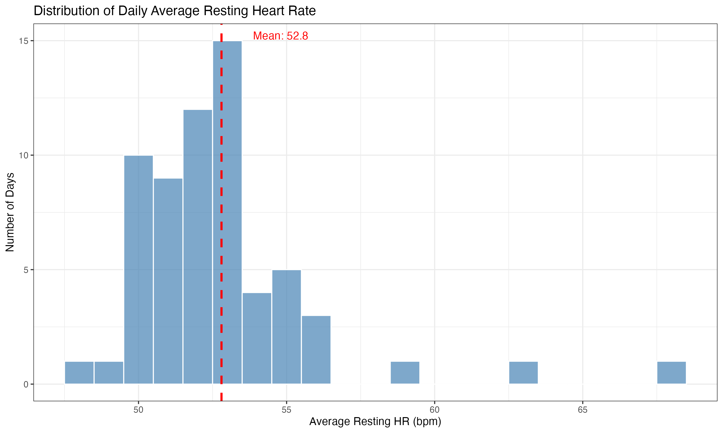
- Average Resting HR: 52.8 bpm
- Range: 47.6 - 68.3 bpm
- Standard Deviation: 3.11 bpm
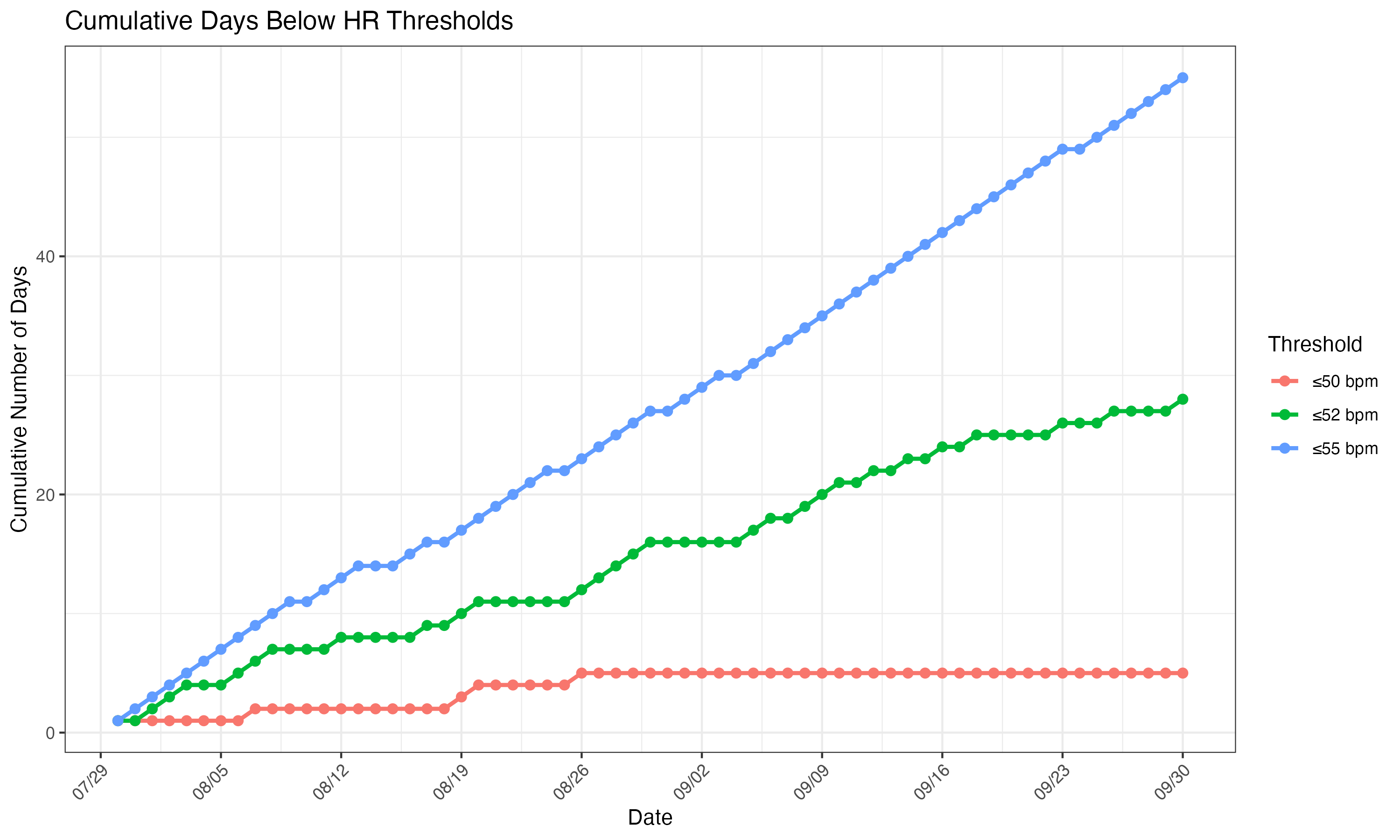
- Days with HR ≤50 bpm: 5 days
- Days with HR ≤52 bpm: 28 days
- Days with HR ≤55 bpm: 55 days
Time Series Analysis
Daily average resting heart rate over the two-month period, with threshold lines at 50 bpm (red) and 55 bpm (orange).
Distribution of Heart Rate Values
Histogram showing the distribution of daily average resting heart rate values. The red dashed line indicates the mean HR.
Cumulative Days Below Thresholds
This chart tracks how many days fell below various heart rate thresholds over time.
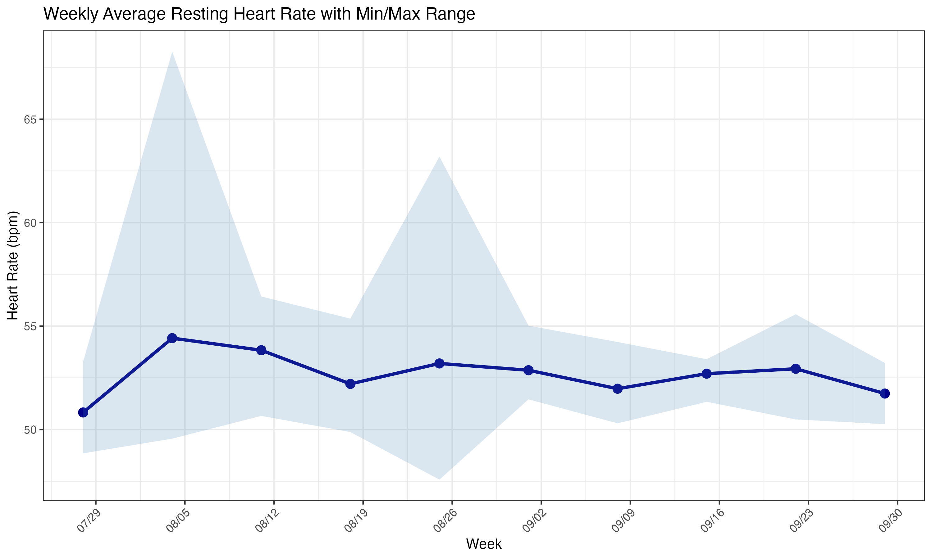
Weekly Trends
Weekly average resting heart rate with the shaded area showing the min/max range for each week.
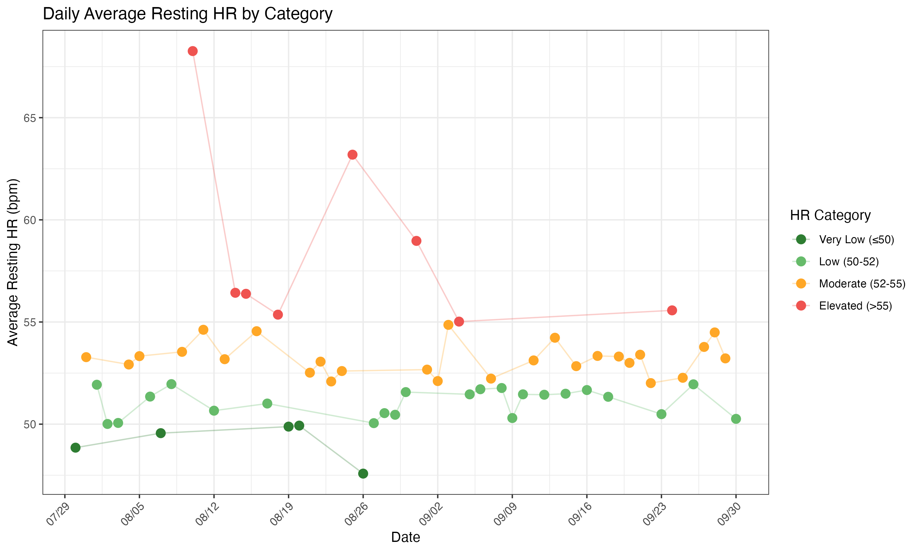
Heart Rate by Category
Daily heart rate values color-coded by category:
- Very Low (≤50): Green
- Low (50-52): Light green
- Moderate (52-55): Orange
- Elevated (>55): Red
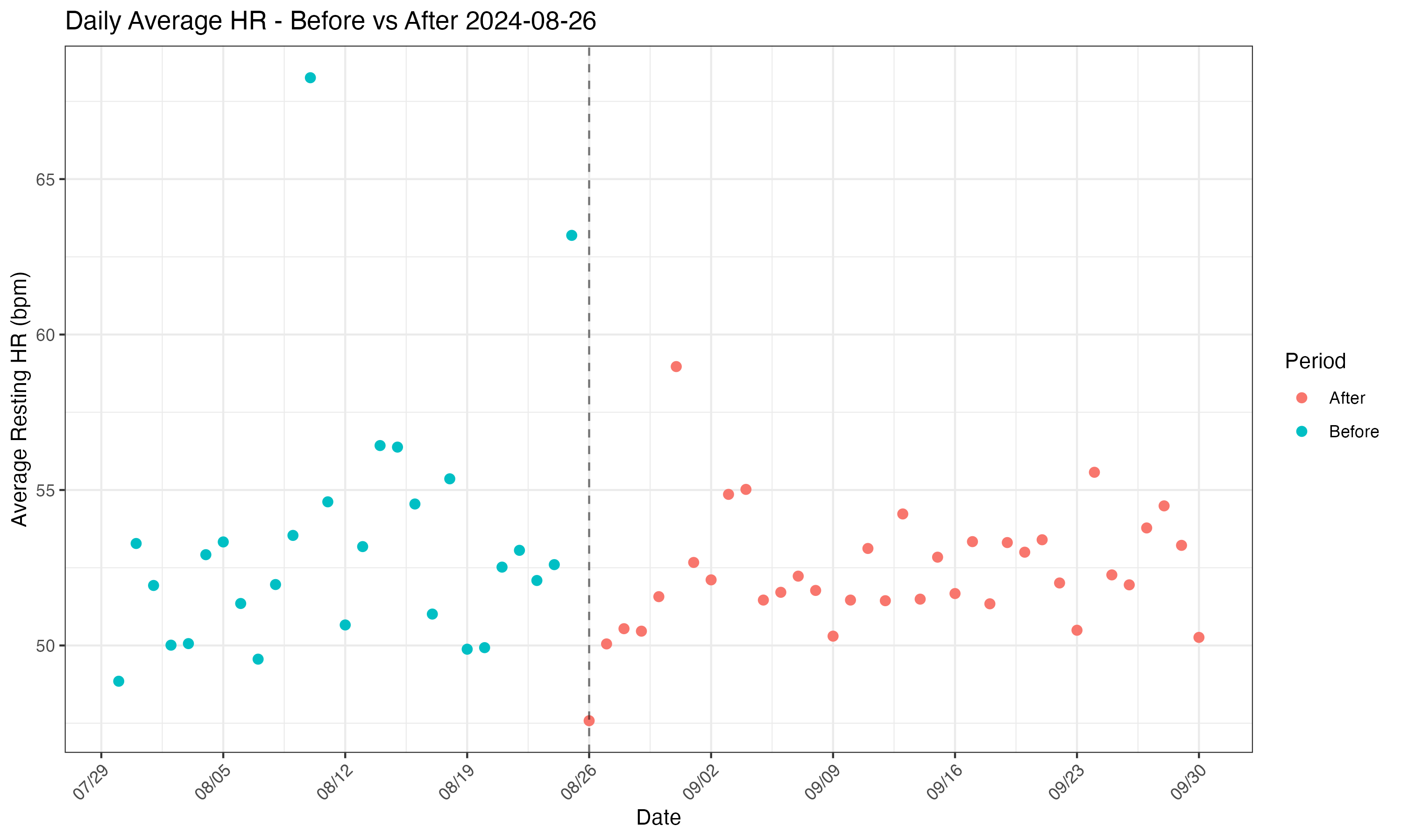
Before vs After Comparison
Comparison of heart rate trends before and after August 26, 2024.
Statistical Comparison:
- Before Aug 26: Mean = 53.4 bpm, SD = 4.16
- After Aug 26: Mean = 52.4 bpm, SD = 1.97
The data shows more stability in the “after” period with lower variability.
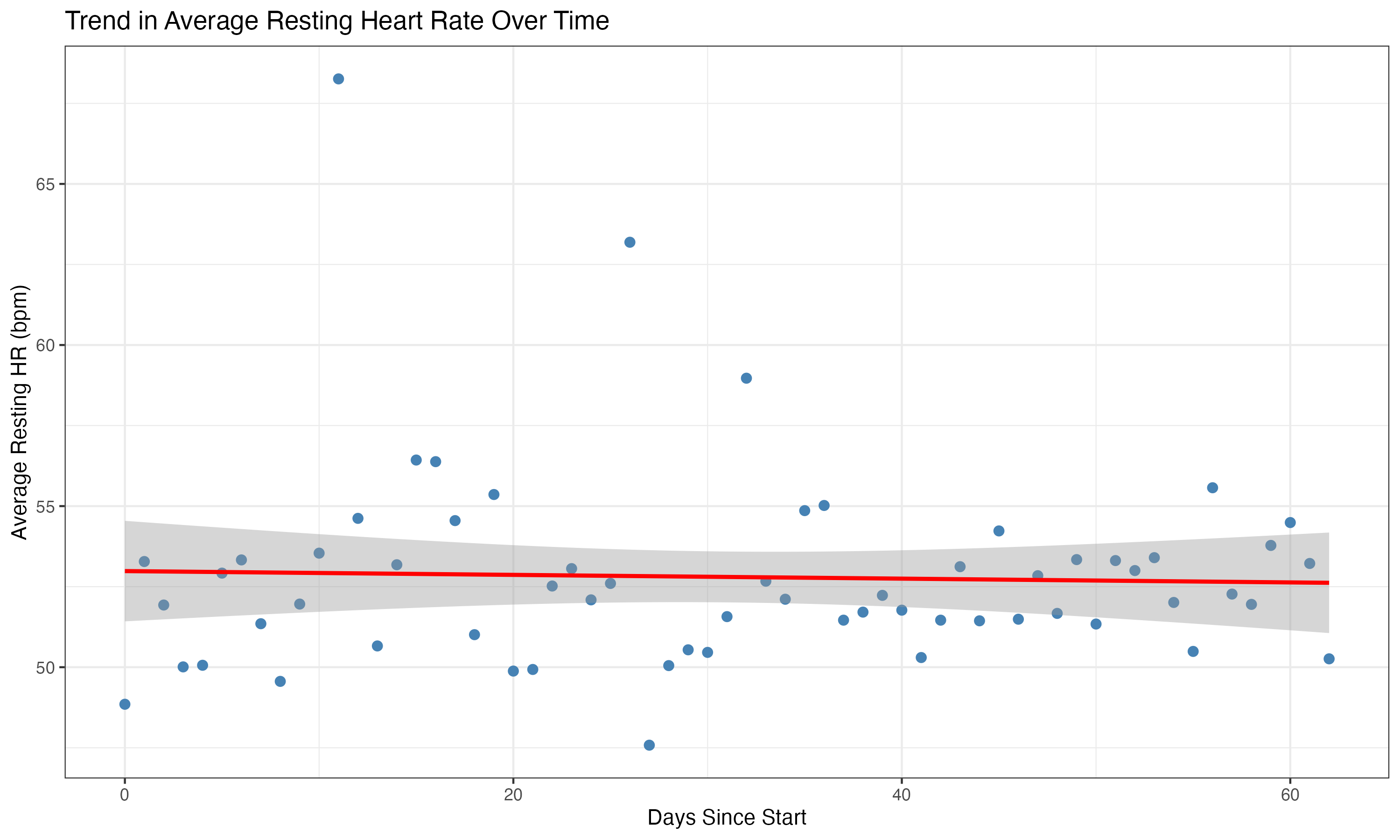
Trend Analysis
Linear regression analysis showing the overall trend in resting heart rate over time. The regression shows no significant trend (p = 0.788), indicating stable heart rate throughout the period.
Methodology
This analysis was performed using R with the following packages:
tidyversefor data manipulation and visualizationlubridatefor date handlingggplot2for creating visualizations
Data was exported from the Oura Ring app and processed to generate daily, weekly, and cumulative statistics.